
Available visualizations
There are different visualizations available in EDA. The different possibilities, depending on the data, are shown below:
Data table
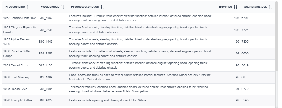
Section titled “Data table”By default, any information will be displayed as a data table. Data tables can be customized by adding totals, percentages, colour values or show / hide repetitions.
Video tutorial
Section titled “Video tutorial”Cross or pivot table
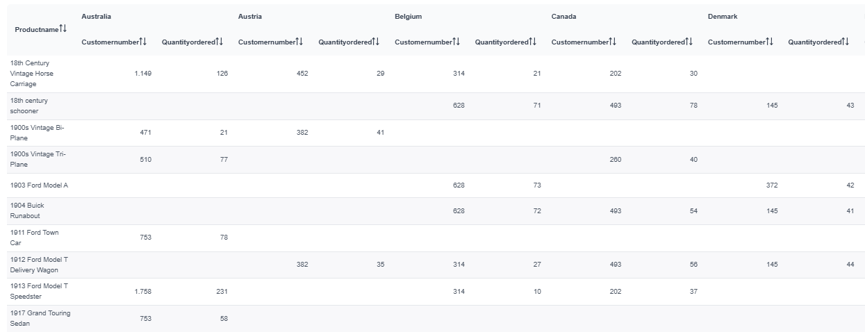
Section titled “Cross or pivot table”A cross table allows to display the information categorized by columns. To create a cross table it is necessary to have two categories (two text columns) and a magnitude (a numerical column). A cross table can be customized by adding totals, percentages, or colour values.
Video tutorial
Section titled “Video tutorial”Navigable columns and dates
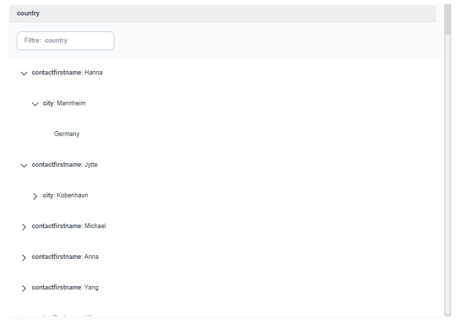
Section titled “Navigable columns and dates”Navigable columns allow you to establish a hierarchical relationship between columns in a table, facilitating the organization and navigation of data.
To configure it, access the three dots in the panel and select “Edit query”. Then, choose which column will act as the parent and save the changes.
Once the configuration is applied, the table will display the information grouped hierarchically, allowing you to expand or collapse the different levels to consult the data in a clearer and more organized way.
Navigable column
Section titled “Navigable column”Video tutorial
Section titled “Video tutorial”Navigable date
Section titled “Navigable date”In the case of dates, the format will be year, month and day.
Video tutorial
Section titled “Video tutorial”DataQuality table
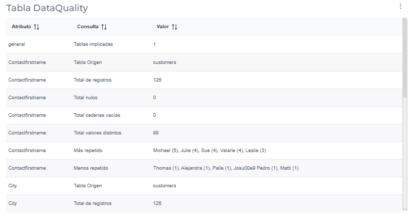
Section titled “DataQuality table”To create this type of table, you must first create the data table. Once the data table is created, go to “Edit Query” (from within the same table) and select “Data Quality Table.” A warning will appear stating that this action may take a while; click the “Continue” button, and the Data Quality table will be created. A Data Quality table can display any information and can be customized by adding totals, percentages, color codes, or showing/hiding repetitions.
Video tutorial
Section titled “Video tutorial”Tree table
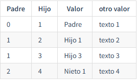
Section titled “Tree table”A tree table allows you to group information by a common parent. This type of table is used to display hierarchical data in a tabular format. To create a tree table, you need two numeric columns that identify parent and child elements.
Example of the data set:
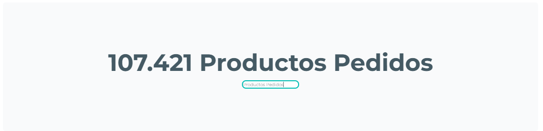
The KPI visualization allows you to display a numerical value (a numeric column) accompanied by descriptive text to facilitate data interpretation. Both the text content and color can be customized using conditional alerts, enabling you to automatically highlight values according to defined rules. Furthermore, you can add images within the KPI —including KPI+Bar, KPI+Line, or KPI+Area variations— and adjust the indicator size to fit the report’s design and structure.
Video tutorial
Section titled “Video tutorial”KPI+Bars
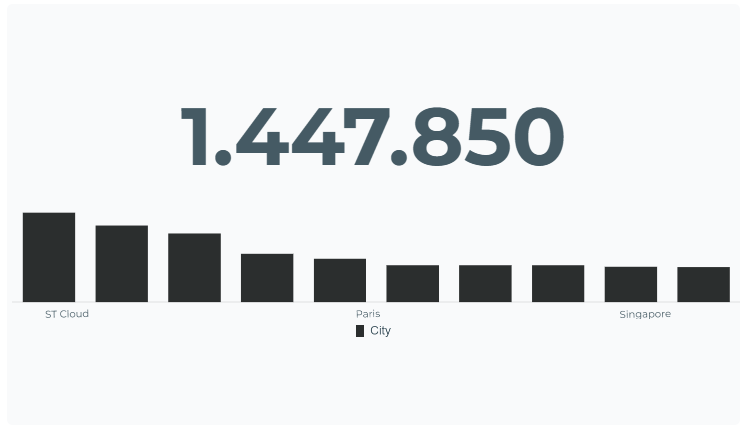
Section titled “KPI+Bars”The KPI+bar visualization allows you to display a metric (a numeric column) on screen and adds text to enhance the display. It also includes a bar chart, which requires a text column for filtering on the X-axis (in addition to the numeric column). You can customize the bar chart color and add conditional alerts based on the KPI visual’s metric.
Video tutorial
Section titled “Video tutorial”KPI+Lines
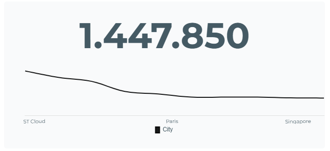
Section titled “KPI+Lines”The KPI+line visualization allows you to display a metric (a numerical column) on screen and adds text to enhance the display. It also includes a line chart, which requires a text column for filtering on the X-axis (in addition to the numerical column). You can customize the line chart color and add conditional alerts based on the KPI visual’s metric.
Video tutorial
Section titled “Video tutorial”KPI+Area
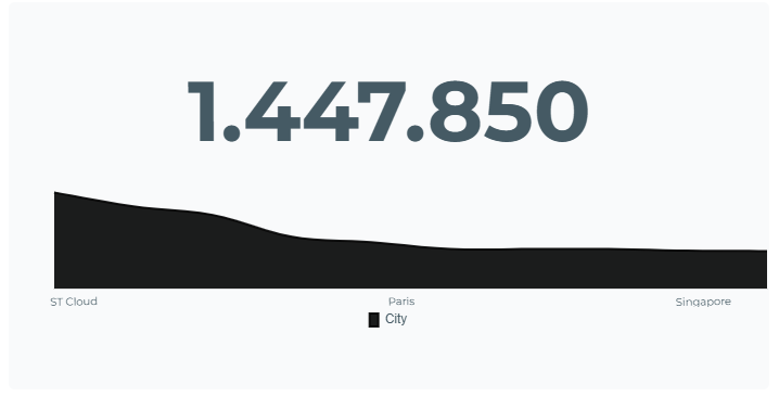
Section titled “KPI+Area”The KPI+area visualization allows you to display a metric (a numerical column) on screen and adds text to enhance the display. It also includes an area chart, which requires a text column for filtering on the X-axis (in addition to the aforementioned numerical column). You can customize the area chart color and add conditional alerts based on the KPI visual’s metric.
Video tutorial
Section titled “Video tutorial”KPI Trend
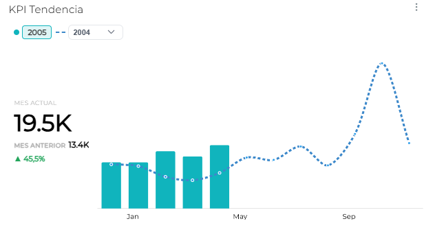
Section titled “KPI Trend”The KPI Trend visualization allows you to compare the value for the current year, month, or day with that of previous periods. It also displays the value for the current period, the value for the previous period, and the percentage change between the two, making it easier to identify the indicator’s evolution. To use this chart, you need a date column (formatted as year, month, or day) and a column with numerical values.
Video tutorial
Section titled “Video tutorial”Deviation KPI
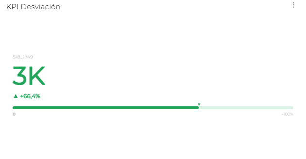
Section titled “Deviation KPI”The Deviation KPI visualization allows you to compare the value of the current period with that of the previous period, displaying the current value, the percentage change, and a progress bar representing the deviation from the reference period. To use this chart, you need a text column or a date column (Year, Month, or Day format) and a numeric column.
Video tutorial
Section titled “Video tutorial”Dynamic text
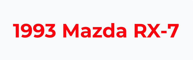
Section titled “Dynamic text”Dynamic Text is similar to the KPI display. The only clear difference is that dynamic text is only used to display text typed data, with the only option to customize in its colour.
Video tutorial
Section titled “Video tutorial”Speedometer
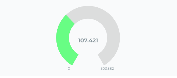
Section titled “Speedometer”This type of visualization allows us to display numerical magnitudes compared to a total (two numerical columns) and only allows us to configure their colour.
Video tutorial
Section titled “Video tutorial”Pie or doughnut chart
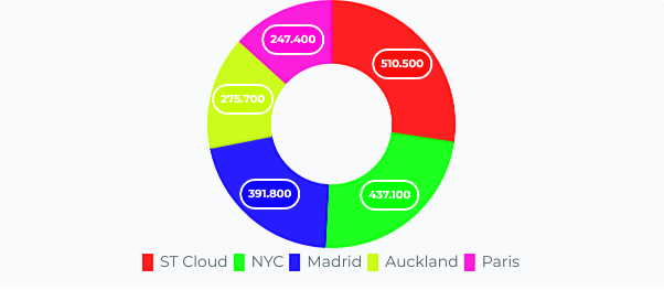
Section titled “Pie or doughnut chart”The pie chart separates numeric and text vectors into a coloured pie. This chart needs: one text column to filter and a numerical field to divide. This chart allows us to customize colour and formats of the displayed text.
Video tutorial
Section titled “Video tutorial”Polar area chart
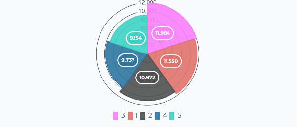
Section titled “Polar area chart”This chart divide the numerical magnitudes into distinct areas, and also calculates numerical averages to form a range from minimum to maximum. This format requires a text column and a numeric field and it is also possible to customize the colours and formats of the chart.
Video tutorial
Section titled “Video tutorial”Sunburst chart
Section titled “Sunburst chart”The “Sunburst” chart works in a similar way to the pie chart, it also requires a text field complemented by a numerical vector, and it differs from the previous visualizations on the format displayed, it will be always calculated on percentages, leaving only the colour options customizable.
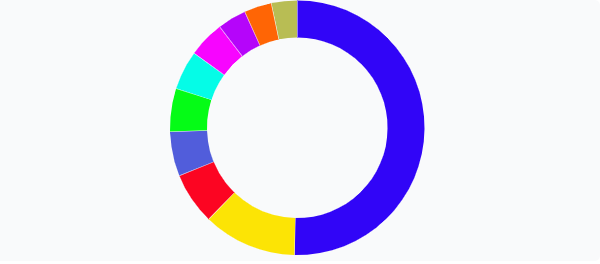
Video tutorial
Section titled “Video tutorial”Bars chart
Section titled “Bars chart”Bar charts are perfect sized to display large amounts of data, they require a column of text to filter by on the X-axis and a numeric Y magnitude to compare. This chart allows to customize the colours and format of the data.
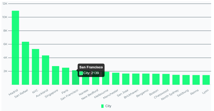
Video tutorial
Section titled “Video tutorial”Stacked bar chart
Section titled “Stacked bar chart”The stacked bar chart requires at least one text field and one numeric field when sorting on its axes, but it can also store additional data additions, and the colours and formatting of the data can be configured.
Additional data to be added to the chart fulfill this set of conditions:
- Only a single text datum can be added.
- Numerical data can be as many as desired, but they will be sorted on the X-axis and will be overlaped on others according to their order.
- Preconditions cannot be mixed, if this is done this chart will not be displayed.
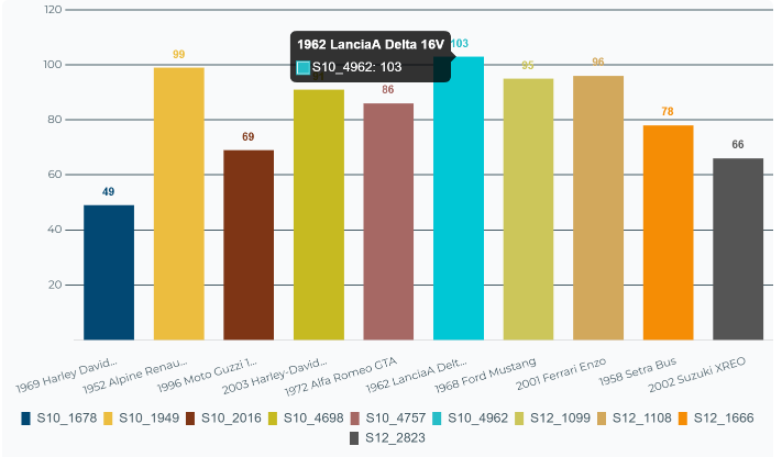
Video tutorial
Section titled “Video tutorial”100% Stacked bar chart
Section titled “100% Stacked bar chart”The 100% stacked bar chart requires at least one text field and one numeric field to be sorted on its axes, but it can also store other added data. Unlike the previous chart (stacked bars), this one will only display a single bar, with the data stacked on top of each other. As with the previous chart, you can configure the colors and formatting of the data.
The additional data added to the chart must meet the following conditions:
- Only one additional text field can be added.
- The numeric data can be any type you like, but it will be sorted on the X-axis and will overlap other data according to its order.
- These conditions cannot be combined; if they are, the chart will not be displayed.
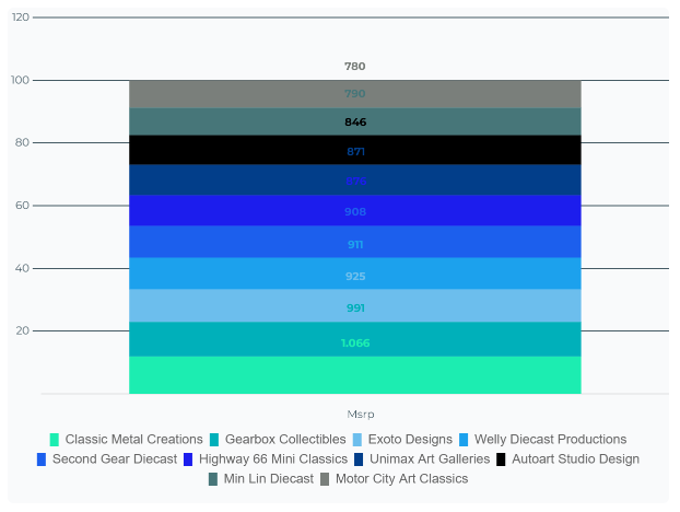
Video tutorial
Section titled “Video tutorial”Horizontal bar chart
Section titled “Horizontal bar chart”Horizontal bar charts also requires a text field with another numerical field. Colours and data format can be customized.
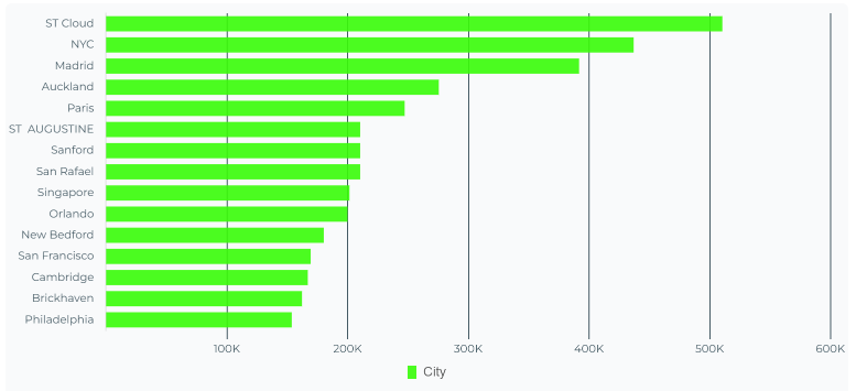
Bar, lines and area charts allows advanced temporal series functions
Video tutorial
Section titled “Video tutorial”Histogram
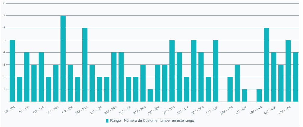
Section titled “Histogram”The Histogram chart reproduces the data by calculating an average of specific ranges from the fields entered. Only one numeric field is needed to form these frequencies and in its configuration you can change its format, colour and number of range columns presented.
Video tutorial
Section titled “Video tutorial”Line charts
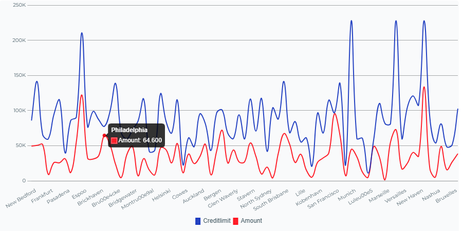
Section titled “Line charts”The line chart represents numerical magnitudes by calculating fluctuations filtered by different text data, therefore, to measure your data with the line chart you need a text vector to filter on the X-axis together with two number fields for the Y-axis respectively.
It is possible to add more than one numeric data to compare, but it is recommended for a better visualization, to limit and filter the data conveniently. We are allowed to configure the colour, formats, the trends of each data and a comparison of an added numeric field if there is a date type data according to month or week in the table.
Video tutorial
Section titled “Video tutorial”Area chart
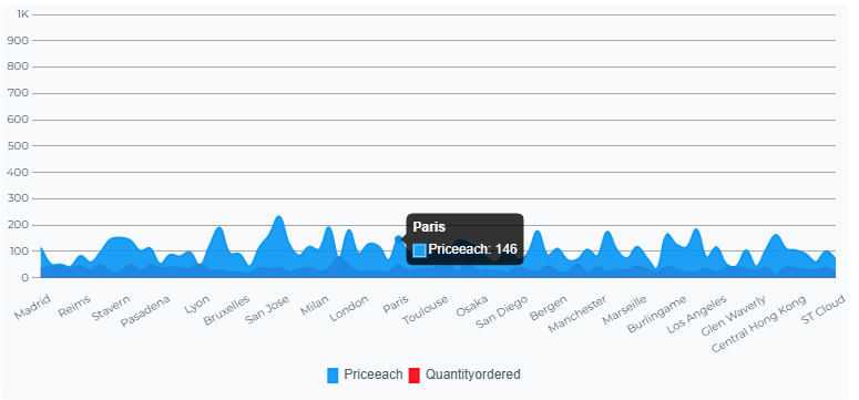
Section titled “Area chart”The area chart also represents the data with ups and downs calculations and therefore requires a text column and two numeric magnitude columns. You can configure the colour, formats, trends of each magnitude with a comparison of a numeric field added if you have a date type data according to month or week in the table.
Video tutorial
Section titled “Video tutorial”Mixed line and bar chart
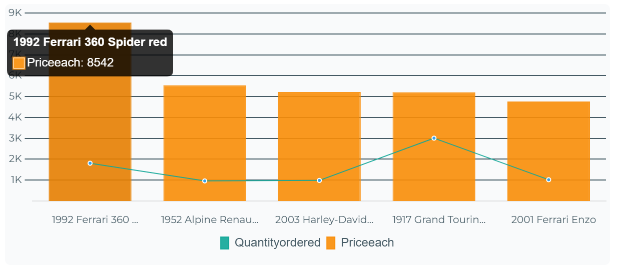
Section titled “Mixed line and bar chart”This type of chart groups the two visualizations of lines and bars by compacting them in the same panel. It only needs one text field to be filtered and two numeric fields to be differentiated between bars or lines respectively. It is also possible to add more than one numerical data, but it is recommended to filter the data carefully, these data can be customized by colours and data format.
Video tutorial
Section titled “Video tutorial”Funnel Graph
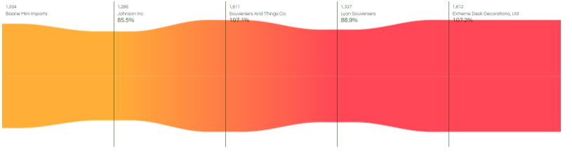
Section titled “Funnel Graph”This chart calculates averages for display on screen, the data bounded by the query itself forms “hot” spots forming a gradient. It requires a text field and a numeric field. In this temperature chart we can only configure the colours of the temperature gradient.
Video tutorial
Section titled “Video tutorial”TreeMap graphic
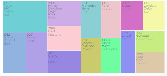
Section titled “TreeMap graphic”The TreeMap chart form offers a differential map where we can visualize the data filtered by a numerical field, therefore, it needs at least a text vector and a numerical vector. It has the possibility to customize the colour of each field of the map.
Video tutorial
Section titled “Video tutorial”ScatterPlot chart
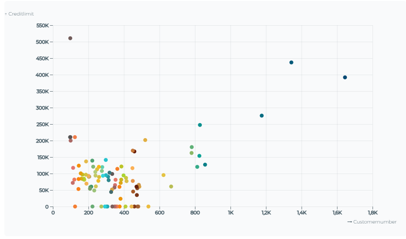
Section titled “ScatterPlot chart”This chart filters by text fields and, together with the numeric fields, organises the data by coloured dots. If these have been more or less frequent, their height is increased/decreased within the ranges printed on the visual. To be displayed, it needs two text fields and two numeric fields. In this visual you can customize the colours of each point.
Video tutorial
Section titled “Video tutorial”Parallel Chart
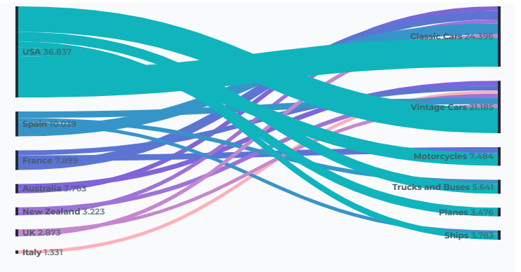
Section titled “Parallel Chart”This chart compares whether the data are related to each other, showing the information in an ordered and symmetrical way with totals differentiated by a text filter. It only needs two text fields and one numeric field, the central text field being the filter determinant. For this graph it is possible to configure the colours of the symmetries.
Video tutorial
Section titled “Video tutorial”Layer Map
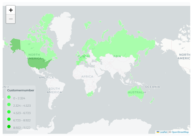
Section titled “Layer Map”This map gives us the possibility to display the information distributed across a map of our choice. Those data and ranges that are provided will be distributed in the specific positions forming a colour map and needs a text type field linked to a GeoJson together with a numeric field. With this type of visual we will be able to modify the colour, position of the map legend, proximity and scale of the map data.
Video tutorial
Section titled “Video tutorial”Map of coordinates
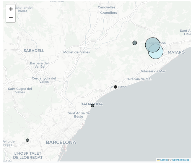
Section titled “Map of coordinates”This graphic allows us to display distributed information across a map of our choosing. The provided data will be distributed across specific positions, forming a color-coded coordinate map. It requires two coordinate fields (latitude, longitude), a text field linked to a GeoJSON file, and a numeric field. With this type of visualization, we can modify the color, the logarithmic scale, and enable/disable mouse functions.
Video tutorial
Section titled “Video tutorial”Pyramid Chart
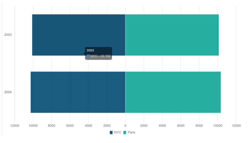
Section titled “Pyramid Chart”The pyramid chart is designed for situations where we normally need a sampling of numbers filtered by date, a text field and a numeric field. In this type of chart, we can only configure the colours of the differences.
Video tutorial
Section titled “Video tutorial”Bubble chart
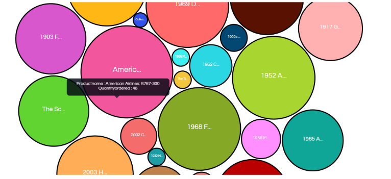
Section titled “Bubble chart”Finally, the bubble chart, this type of graphic will generate from a text field and a numerical vector, a dynamic panel where bubbles will appear and depending on the total filtered by the text, the size of the bubble will increase. In the bubble chart, we will be able to customize the colour of each bubble and optionally drag them where we want at all times.
Video tutorial
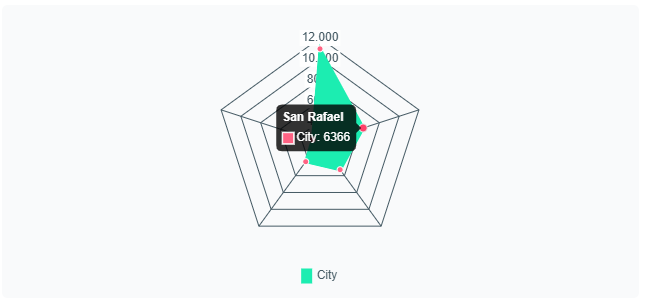
Section titled “Video tutorial”The radar chart displays a two-dimensional graph that uses radial axes to plot one or more groups of values across multiple variables. This visual requires a text column and a numeric field. Colors and display options are configurable.
Video tutorial
Section titled “Video tutorial”Change chart type
Section titled “Change chart type”Changing the chart type of a dashboard is very simple. Access the three dots on the dashboard and select the “Change Chart Type” option. Then, choose the new chart type you want to apply. Only chart types compatible with the previously selected data will be displayed in this section, ensuring accurate information visualization.
Video tutorial
Section titled “Video tutorial”Traffic light codes
Section titled “Traffic light codes”The traffic light code allows you to apply a color scale to the values of a graph to facilitate their visual interpretation.
To configure it, access the three points of the panel, edit graph options and select the “Traffic light code” option. Next, define the value ranges and assign a color to each of them.
Once the configuration is confirmed, the elements of the graph will be colored according to the range to which they belong, allowing low, medium and high values to be quickly identified through a traffic light-type visual representation.
Video tutorial
Section titled “Video tutorial”Color palettes
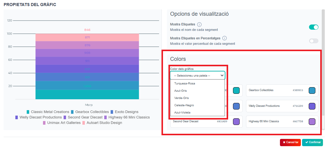
Section titled “Color palettes”And now you can also choose one of the 5 preset palettes for each panel/chart. The one you choose will be printed automatically to the chart, you will be see it in the left of the box, and if it is the one you want, just “Confirm” and save changes.
Steps:
- Choose the panel/chart and “Edit chart options”. In the colors section, dropdown “Select a palette” and there will be the 5 preset palettes. You will see the preview on the left. Choose the one you like it and save it.